Showing posts with label ceilings. Show all posts

Wednesday, August 13, 2014

Pic o' the Day #1324- What a Pain in the Neck!

One of the first things that started me down this rabbit hole of ornamental research was wanting to know about Pompeian style ceilings for a project I was working on. At first I had difficulty finding images of ceilings, but I now have about 350 of them, including these. I'm a little surprised at the energy that was often spent on ceiling decorations, which are very hard on the body, making it difficult and time consuming to do. For more photos of what I did at the house go to this earlier post.


This is a ceiling in the Casa del Salone Nero (Black Salon) in Herculaneum, with a ceiling that preserves both the painting and the vaulted form.

This is a reconstruction drawing of one of the ceilings in the Domus Aurea, Nero's palace in Rome.

Here's what I came up with for the ceiling at my project, with a bit of frieze inspired by the Villa della Farnesina in Rome. I'm still waiting for the go ahead to do the walls of the room!
By the way, Michelangelo never painted lying down; here's his little drawing of himself, in a letter where he is complaining about the pain in his neck!

Wednesday, August 24, 2011

House of Heinsbergen, part three- to Infinity...and beyond!

So, at this point (after painting the library and the Pompeian room ceilings; see previous posts) it's beginning to look like the never ending job, especially after we've walked through the rest of the house and outlined  projects for other rooms, some of which aren't even constructed. My client is never short of inspiration, and he's a very good designer himself, so we've had numerous ideas for hallways, bedrooms, grottoes, etc.,


 This was a design for an outdoor terrace floor to be done in terrazo- it has not been executed yet. I'm wondering now if it might be attempted in colored concrete of some kind.

We began designs for the hallway outside the upstairs bedrooms around this point I think, though it's sometimes hard to remember what came first with so many overlapping ideas. I have also kept my outside art projects going through some periods of this house, and at this time I was preparing for a show of watercolors at the Torrance Art Museum, so the sequence gets a bit blurry to me at times. Anyways, here's one of the sketches I did for the hallway ceiling in a French grotesque style.


We shifted focus to the master bedroom at this point and this design was never used, but it was a fun learning experience to do it.

The master bedroom is French neo-classical in the style of Percier et Fontaine; grisaille ornament on a gold leaf background and paneled all around. Here's the layout for it.


It also has not been constructed yet, so the work, which I completed 3 or 4 years ago, is sitting in my studio all rolled up and waiting for the day that the doors get moved and the panel moldings go up, so that they can be attached and gleam. The over door panels each have bas relief portrait busts in a classical mode, including Napoleon and Josephine, and a single image of Medusa, seen here:


The  long narrow panels that flank the doors and windows are based on Giovanni da Udine's  ornament for the "Raphael loggia" at the Vatican. Detail of it seen here:


I can't wait for this room to be installed- I think it will be quite stunning!

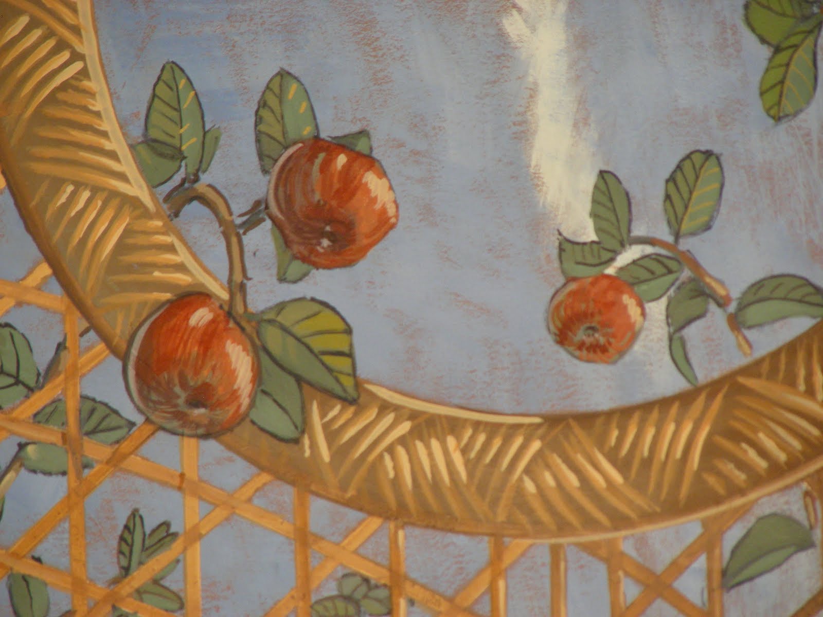
After this room came the loggia (covered porch) which connects the three upstairs bedrooms. It had to be created by joining and expanding 3 smaller and enclosed porches into one long space. This left it with three bays divided by support beams; each bay is 7 feet by 12 feet and about one foot deep. The theme for this area is Adam and Eve, so I designed a trompe l'oeil trellis pattern with some depth, covered in apple tree branches and numerous birds as per my client's request. I did a barrel vault for the two side panels, and figuring out the curving hexagonal pattern was very tricky. I did not use Photoshop this time around, although I probably could have. This is one of the side panels:


And here's a little detail where you can see how I painted the sky over a raw sienna background so that you can see the underpainting showing through and giving the strokes some texture. The whole mural will be glazed darker and then sanded through to give it an aged effect after it has been mounted on the ceiling- if that ever happens! Actually, it's looking like we're getting closer now, having finished some of the construction hurdles such as putting the tiles on the roof.


Next up: Restoring the living room ceiling!

Sunday, August 14, 2011

House of Heinsbergen, part two- the Library

This is a continuation of posts that began a couple of weeks ago; I recommend that you start at the beginning of them (if you haven't), as they are somewhat sequential, unlike this post, which I realized, while writing it, is out of sequence to the progress of jobs at the house. Can you imagine a residential project that lasts so long that you forget which room came first? That's the nature of this job, which I have been involved with for almost 10 years now!

The first project after the upstairs hallways was for a library ceiling in a new room that had been created from two smaller rooms. My client had become enamored of the idea of the English library, with paneled walls, parquet floor, and neo-classical ceiling a la Robert Adam. The design was a bit tricky as the room is long and narrow, with doors that open on the long sides and an asymmetrical layout for the end where the desk sits.
This was the first design I came up with. My client wished for a bit more depth, and also the color purple,  so I did a second design that had a different colorway and a more centralized image, while still lining up with the entry doors. Symmetry and alignment are a big part of neo-classical design, and I spent many hours laboring over how to arrange things so that they would line up correctly.


Here was the second design. The brown border represents the crown molding as it undulates over the doors and mantel. I used Photoshop to give me an accurate template for the trompe l'oeil curving of the central section. The cartouches around the border each contain painted bas relief busts of famous artists, musicians, and writers. The central image in this design was of Mercury, but was later replaced by a scene of Jupiter and Ganymede that I cribbed from a drawing that Michelangelo had done but never painted.


This is one of the full sized samples that I made both for the client's approval and to work out the colors and techniques I would use in the actual mural. It's about 14" high by 8 feet long. I made a number of similar samples of different areas of the mural so that we would both have a solid idea of what the finished product would look like. I designed it so that the border is a separate strip of canvas that surrounds the central section, so that I would have a bit of leeway to adjust the placement during installation. Measurements are my nemesis- it seems that no matter how many times I measure something, I inevitably end up slightly off somewhere, and I like to give myself some safety measures so I won't have to start something over. There's nothing I detest more than having to do something over again because of a mistake I've made in measuring.


Here's an early shot of the central portion of the mural, which shows Jupiter, in the form of an eagle, swooping down to snatch the beautiful young Ganymede and bring him back to Mt Olympus to be his "cup bearer". This story, which is widely seen as an allegory for homosexual love, has been depicted thousands of times in art, going all the way back to the Greeks. In this picture you can see my sketches on the left, and a painted maquette I did for it on the right side.


This is how it turned out in the end. The putti I borrowed from Tiepolo; the upper one holds the cup that will later be Ganymede's. The smaller roundels, which you can see in the upper photo, each had depictions of various Roman gods, and were surrounded by ornament painted to look like carved plaster on a colored background, as Wedgwood or Adams might have done. Because the ground was skewed to give the illusion of a vaulted ceiling, each piece had to be drawn custom and transferred to the canvas. My method is to draw the ornament on tracing paper, then to trace it to the back side of the paper (cleaning up the lines as I go) then flip it back over and rub the drawing from the front with a bone burnisher to transfer it to the painting area. Here's a drawing for part of the ornament surrounding the roundels.


You can see how the roundness of the roundel is distorted because of its being seen in a curved perspective. Thank you Photoshop!Here's how that ornament looks rendered in paint


After the center was done I did the strips of border (I'd do it all at once, but my studio isn't that big.) The portrait busts on the window side of the room all have up lighting to reflect how they would look in natural light, so they look a bit spooky.


Once the border was done I brought it all up there, and with the help of almost every single person at the house (including the housekeeper and the owner!) we got it up and aligned properly. I was actually off by about two inches in my measurement of the length, but because I had planned ahead and had room to spare on the borders, it was unnoticeable. After it was up and set for a few days, I filled the seams between the center and the borders, then added an antiquing glaze, sanded the whole thing to bring it some age, and finally varnished with a matt varnish. Here's how it looked installed:


Epilog: after this ceiling had been installed for a few months, my clients heard water running late one night and came downstairs to find that a rat had chewed through a sink hose in the kitchen, which is directly above this room, and that a large amount of water had seeped through the floor and formed numerous bubbles behind the surface of this mural. We're talking 4 foot diameter bubbles that probably contained a gallon or two of water each! The parquet flooring was the more immediate problem, and we decided to see if (after draining it) the ceiling would dry out on its own and tighten up. Not the case! They came home from a trip to find the mural, with half of the drywall still attached to it, lying across the top of the furniture in the room. After removing the part that was still glued to the ceiling, I began the laborious task of getting all the drywall, paper, paint and wallpaper paste off the back side so I could reattach it once they had repaired the ceiling. It took a great deal of soaking and scraping to get it all off, but in the end, it made me feel very confident about the longevity of the technique and materials I use, in that after all that abuse, I lost very little of the actual paint work of the mural, and it didn't even shrink enough to make much of a difference at all. In fact, I think the end result was an improvement, as I added a small molding to the edge of the border that makes the trompe l'oeil even stronger.


Wednesday, August 10, 2011

House of Heinsbergen, part one

About two years into doing my own thing I got a call from my friend Paul, who had a pre-cast molding company here in LA, about a guy who was looking for a painter to redo some murals at a house in Pacific Palisades that was originally owned by Anthony Heinsbergen. Even though I wasn't really interested in pursuing decorative work at the time, I told him I'd take a look, if for no other reason than curiosity.
Over the front door of the house it says "Domus Constructa Pigmento" (The House that Paint Built)

Anthony Heinsbergen, for those who don't know, was the head of a large (up to 185 employees at its peak) decorating firm that was responsible for the vast majority of painted theaters and other public spaces around Los Angeles and the West Coast. During the history of the company, from the early 20's until the 1960's, they were responsible for over 700 projects, including the Pantages theaters, Warner theaters, the Los Angeles City Hall, and many others.


Los Angeles Elks Lodge, ceiling detail, by Heinsbergen Decorating Company, 1923.

The new owners of the home Heinsbergen had built for his family on a beautiful bluff overlooking the Pacific had received an album of black and white photos of the house as it looked when it was built in 1930. They wanted to restore some of the ceilings that had been removed during a stint when Joseph Cotten and his wife owned the house and had "modernized" it with white shag carpets and white walls. 

This photo, showing the house as it originally looked around 1930, was my main reference for recreating the ceiling


When I saw this photo I knew I was going to be involved in this project, though I had no idea just how big it would turn out to be. My old boss Doug Bouman had worked for Heinsbergen as a teenager, and his dad and uncle were Anthony's right hand men. When I saw some color slides of the house taken some years later, I noticed they were addressed to Frank Bouman. It has been an ongoing idea to create a book on Heinsbergen, who should really be an LA icon, but is largely unknown today. When you compare the output of his work to that of the great Renaissance painters it most definitely holds up, even if much of it was derivative (an apt characteristic for the chaotic growth of the city and the movie industry that supports much of its wealth)

As requested, I drew up maquettes for the ceiling shown above, and we were lucky to be able to show them to Anthony's son Tony, who had spent his younger years in the house, for color consultation. After a few small revisions I got started. Here's how the upper hall turned out:


At the same time, I did the lower hallway ceilings, and a frieze band with birds painted over gold leaf, also in imitation of what was originally there.


After this work was done we began looking at ideas for other rooms- the new owner is never short on ideas: he is an avid design reader and has been a very active participant in the design process at every level. The next room we turned our attention to was the two story room that had originally been Heinsbergen's studio, but had been turned into an indoor pool somewhere along the line. Eventually it is planned to become a movie theater. The first idea was to do it in a Greek style, inspired by the Villa Kerylos, in southern France.

It soon changed to a Pompeian theme, which really got me started with the research aspect of the last few years. The owner and I booked a date to look at the Getty Museum's collection of antique books on Pompeii, which is vast and beautiful. It was a bit frustrating though, in that you can look, but not photograph, the images. There are wonderful 19th century books that have full scale drawings of designs from Pompeii that I would love to copy! In any case, before long I got started on a full scale maquette of the coffered ceiling, built out of cardboard and wood, so that the owner would truly have a WYSIWYG model to go by for the colors and designs.


There are 27 panels like this on the whole ceiling, and this maquette has different ideas for different parts of it. I counted up one time and found that there are over 3,000 egg-and-darts altogether! I enlisted the help of some of the Guatemalan workers from the job to fill in the base colors- when we finished it looked like a Mc Donalds restaurant with bright red, yellow, and blue!


Yikes! Makes you wonder how some of those Roman era houses looked originally, before they got the lovely patina of dirt and abrasion to mellow them out. I trained some of these guys to also help me with the ornament, since so much of it is simply repetitive marks, though even that is a challenge for some.  There were so many steps in the process of completing each section- we had a scaffold that straddled the pool, but it only covered one third of the ceiling at a time and moving it was a process, so I tried to complete as much as was possible in each section before moving on.


In all, it took over a year to complete this ceiling, as it has many detailed bits. Then it was all antiqued and abraded to soften the look. Here's how it turned out:
 

and here's a detail, prior to antiquing.


The ceiling is actually just a prelude to the walls, which haven't happened yet as they are waiting for the construction to catch up. I certainly hope it happens one of these days.
For more photos you can go to my Flickr set on the house, which we also call the Villa Tramonto.